In 72 hours…

It’s amazing how a (somewhat) slight product change can define a whole new set of behaviors. On October 29th 2013, Twitter launched inline image previews directly in the timeline, allowing users to view images without clicking through a link. In the one year since inline images launched, there has been a trend of sharing screenshots of text (usually from mobile devices) to Twitter, which allows the user to share specific parts of an article without exceeding the 140 character limit…
At betaworks, we’ve been curious about this trend since it began and, by now, it has become pretty hard to miss if you’re working in technology. Some of the most prominent journalists and venture capitalists have been tweeting text shots, and with good reason. Look at the engagement difference between these two tweets about the same article:
Nikola Tesla predicted the iPhone - "A man will be able to carry one in his vest pocket” http://t.co/ADlkH1HpWR
— Chris Dixon (@cdixon) November 19, 2014
Nikola Tesla predicting today back in 1926 pic.twitter.com/5Air6JEULu
— Chris Dixon (@cdixon) November 20, 2014
Sunday, February 22nd
I received a brief email from John Borthwick (CEO at betaworks):
Could we add a share from Instapaper where I share an image of a highlight (however long it is) and we figure out the URL formatting etc. to make it clear that its an image of a highlight from Instapaper. Sharing would be to Twitter and Instagram.
I had spoken with Instapaper designers Justin Van Slembrouck and Aaron Kapor in the past about doing this, but the priority was always lower than some other, more pressing task. However, with the rise of tweet shots, apps being made to assist in the creation of those screenshots, and an imminent Instapaper iOS release, it made sense to take a day or so to try and build a tweet shot feature for Instapaper.
We started by looking at existing behaviors and identifying some obvious issues with the current process:
- It’s cumbersome: Creating a tweet shot takes about 10 steps.
- Hard to read: At times, the original image is too large for Twitter, and the results are tiny font sizes, weird line heights, and too many or too few characters per line.
- Not glanceable: Tweet shots often do not fit within the Twitter image preview, which is further complicated by the fact that the image previews are slightly different on desktop and mobile.
- Clutters the camera roll: Because all of the existing solutions required a screenshot before image processing, the person’s camera roll becomes cluttered with screenshots.
With the above in mind, we set out to make sure of the following for Instapaper tweet shots:
- Beautiful typography with an emphasis on readability that, whenever possible, wouldn’t require expanding the image.
- No screenshots cluttering your camera roll.
- No more than three taps to send to keep things really easy.
Monday, February 23rd
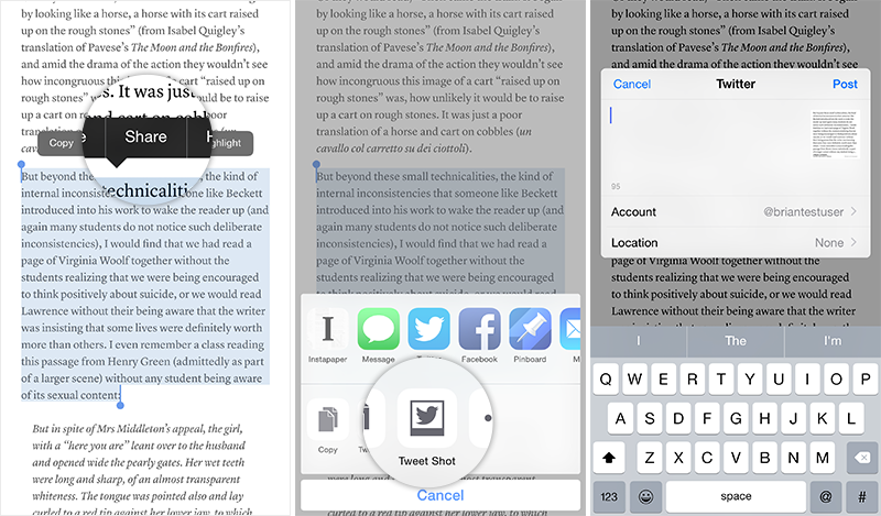
The first thing we nailed down was the three-tap send, which could actually be done in just two taps by users that had already created a highlight of the text they wanted to share:

We were able to achieve three-tap tweet shots by doing the following:
- The image is generated programmatically when you tap the “Tweet Shot” button. The app sets up the aspect ratio and type properties automatically rather than have the user crop and adjust a screenshot.
- No “preview” version of the image. You’ll get a little thumbnail preview before you hit the “Post” button on the Twitter share sheet, but that’s it.
- Use Instapaper’s built-in customization to generate the image using the current font and background color.
Tuesday, February 24th
After some trial and error, we managed to finalize the layout of our tweet shots with the text in the user’s current font and article metadata & attribution in HelveticaNeue:
— Test (@briantestuser) February 24, 2015
Then, we started working through some edge cases…
What happens if you only select one sentence?
http://t.co/T0DtXvvjsc
— Test (@briantestuser) February 24, 2015
But beyond these small technicalities pic.twitter.com/7hKLiu0ujl
http://t.co/T0DtXvvjsc
— Test (@briantestuser) February 24, 2015
But beyond these small technicalities pic.twitter.com/N0tOu1XRPf
What happens if I choose a very long selection?
Such wall of text pic.twitter.com/FQzQg4YZ6b
— Test (@briantestuser) February 24, 2015
Lastly, we started testing a ton of different font and background combinations to determine if there were any weird edge cases:
:-) http://t.co/O4y7JwdhC6 pic.twitter.com/bVkRQBcaOi
— Test (@briantestuser) February 24, 2015
— Test (@briantestuser) February 24, 2015
Wednesday, February 25th
With the broad strokes finished, our designer Aaron and I embarked on the painstaking task of going through every font in Instapaper and adjusting line heights & font size to make sure the images were perfectly set. After we completed all of the typography tweaks, I went through each of Instapaper’s 14 fonts, took screenshots for one sentence, two sentences, and a paragraph, and collected the generated image, the inline desktop view, and the inline mobile view for each screenshot in each font.
Once I collected all of the images, I sent them to Aaron for a final review. You can find the deliverable I sent him here if you’re interested.
Thursday, February 26th
We shipped the release version of Instapaper 6.2 to our TestFlight testers (tweet shots were one of four major features in this release) and, after a week, submitted to the App Store for review. Here are a few of the earliest tweet shots from Instapaper testers:
Testing @instapaper tweetshots. This makes my life much easier. http://t.co/LJGrPues1K pic.twitter.com/yYRjU7yY92
— ryan (@internetryan) February 26, 2015
Thank you @bthdonohue! This is a real treat.
— Joe Caiati (@JoeCaiati) February 26, 2015
cc @mgsiegler http://t.co/na8KErtqc7 pic.twitter.com/UcMEJvkhl7
.@bthdonohue the tweetshot have really a great design. I love them.
— Daniel H. (@dahanbn) February 26, 2015
Here is an example. Love @instapaper. pic.twitter.com/0gWk5eX1ML
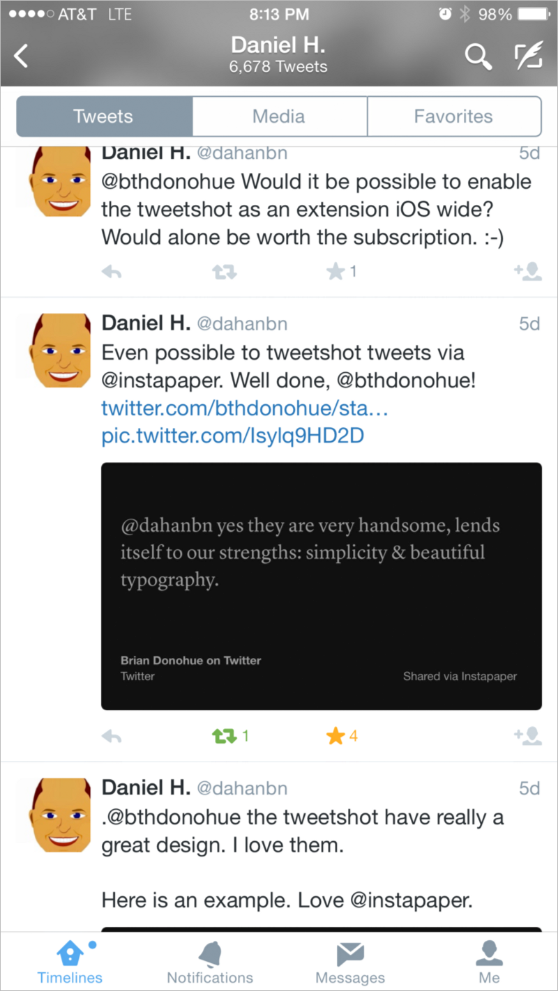
Daniel H., whose tweet is featured above, did something pretty interesting with Instapaper’s tweet shots. In reply to the above tweet, I wrote:
@dahanbn yes they are very handsome, lends itself to our strengths: simplicity & beautiful typography.
Daniel then saved that tweet to Instapaper, and created a tweet shot of my reply:
Even possible to tweetshot tweets via @instapaper. Well done, @bthdonohue! https://t.co/KSSAQMOFkn pic.twitter.com/Isylq9HD2D
— Daniel H. (@dahanbn) February 26, 2015
Twitter recently reintroduced embedded tweets in the timeline, but as far as I can tell, this is a totally original use of tweet shots, and it’s always really exciting to see someone use your product in a way that wasn’t explicitly intended.
Also, it looks amazing inline:
