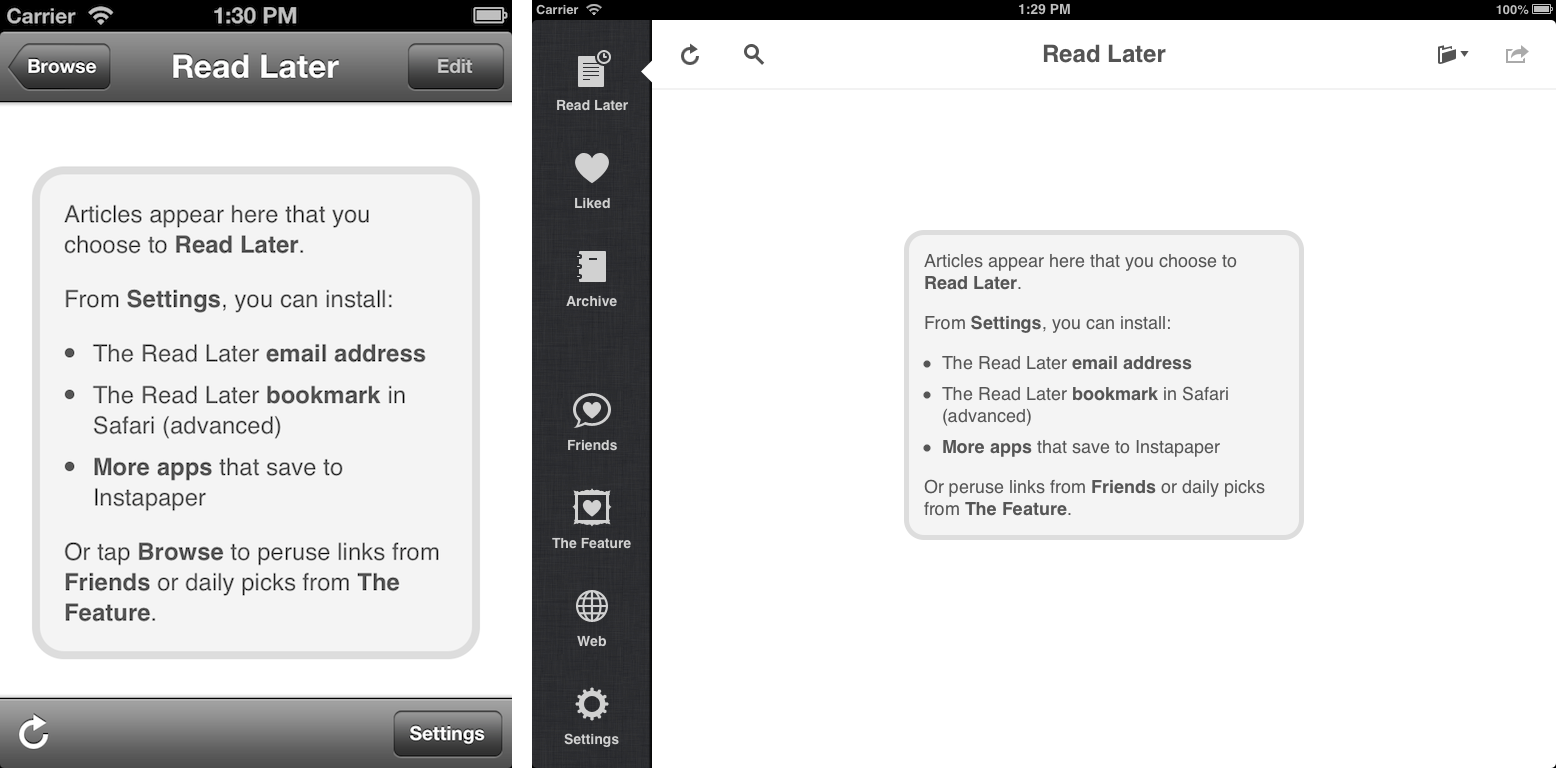
The onboarding process for Instapaper is inherently complicated by the fact that the “Save to Instapaper” workflow is split across the mobile apps, desktop browsers, and third-party integrations. However, prior to the Betaworks acquisitions, Instapaper’s onboarding was still not the best experience it could be. For instance, this is what iOS users saw after logging in the first time:

There are some obvious problems with this approach…
- It isn’t clear what will happen when a user saves articles.
- The methods to save articles are not directly actionable and can only be accessed after several clicks through other parts of the app.
- This screen also doubles as a “no content view.” Thus, when a user finishes reading all of their articles, the onboarding screen is presented again.
New Onboarding
With these issues in mind, we revamped the iOS onboarding experience with a focus on making each method of saving an article actionable:

Grant Custer then created a “Welcome to Instapaper” email featuring this beautiful GIF that really illustrates the desktop Instapaper workflow:

“Welcome” Blog Post
From 12/12 through 12/19, Instapaper was free on iOS as part of the Apple Free App of the Week promotion (which was extremely successful). Ahead of the promotion, we separated the onboarding flow from the “Read Later” article list and only showed it to users that registered for the first time. During that week we still received a ton of emails from new users that downloaded the app but didn’t understand how to use it.
In response to the user confusion, we quickly created a “Welcome to Instapaper” blog post and automatically saved that article for each new user:

Here’s what I love about this approach:
- The onboarding shows the value proposition of the app. It becomes clear what Instapaper does while simultaneously teaching the user how to save articles.
- It gives us more room to explain each feature, as we’re not constrained by the size of the user’s screen.
- We can visually explain how to save on the desktop using the excellent GIF that we embedded in the welcome email.
- At the bottom of the blog post we give users a way to get in touch with us if they need further assistance.
Moving Forward
Because of the quick turnaround with the blog post, we couldn’t make any of it actionable as that would require changes to the app itself. Ideally, each method to save an article would be a link that hooks into native functionality to perform that action. Moving forward, we’ll be removing the swipe onboarding and relying solely on the blog post to walk the user through their first interaction with Instapaper.